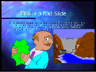
Look at the following slide so we can talk....
Notice how small the words are.
Notice the pictures that do not mean much.
Notice the complete sentences.
The text should be in a color that stands out.
At least the title is big enough (about 36 point in a standard font).
Now look at this one!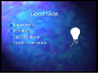
LARGE font.
Six lines or less.
Just key words, not sentences.
Graphics enhance concept.
Colors contrast with background.
Each line unfolds individually to help focus attention.
And, of course, clear handouts so the audience does not have to focus too much attention on writing.
Got it?
Copyright 1998 by Christopher I. Cobitz
Questions regarding this page may be sent to Christopher
I Cobitz